Have you ever held a brochure or postcard that instantly told you what a brand was all about before you even read a word? That’s the power of thoughtful design, when print materials reflect your brand’s personality so clearly that they speak for you.
The way colors blend, the paper feels, and the layout flows can create the same emotional response as walking into a well-designed home. Whether your brand is warm and welcoming or sleek and modern, every printed piece should echo that identity, giving people a tangible sense of who you are and what you represent.
What Does “Your Home Brand” Really Mean?
Your home brand is more than just a logo or a color palette. It’s the overall impression people get from every part of your business or creative space. It’s how your work feels when someone walks into a room you’ve designed, reads your brochure, or visits your website.
A strong home brand communicates personality, values, and style instantly. Whether your brand is warm and inviting, minimalist and modern, or creative and bold, those choices say something about who you are and what clients can expect.
When you translate that identity into print, consistency becomes key. The same feeling people get from your living space should come through in your printed materials.
If your brand is cozy and family-oriented, soft colors, textured paper, and handwritten fonts might suit you. If it’s sleek and contemporary, clean lines and neutral tones may fit better. Every design choice should reinforce the mood and message you want your audience to remember.
Why Print Still Matters in a Digital World
Even in the digital era, print holds a kind of influence that online media can’t replace. Physical materials create an experience. The texture of the paper, the weight of a card, or the way colors look under natural light.
People tend to keep printed pieces that feel authentic or beautiful, whether it’s a brochure, a postcard, or a custom-printed book that tells your story in a more personal way. Studies show that tactile marketing can increase recall and trust because people physically engage with it rather than just scrolling past.
Print also adds a personal touch that complements your digital presence. While online ads reach people quickly, print feels intentional and lasting.
A well-designed flyer or postcard can make your brand stand out locally and build credibility. When both digital and printed materials share the same message and look, your brand appears professional, consistent, and trustworthy, a combination that still makes a lasting impression.
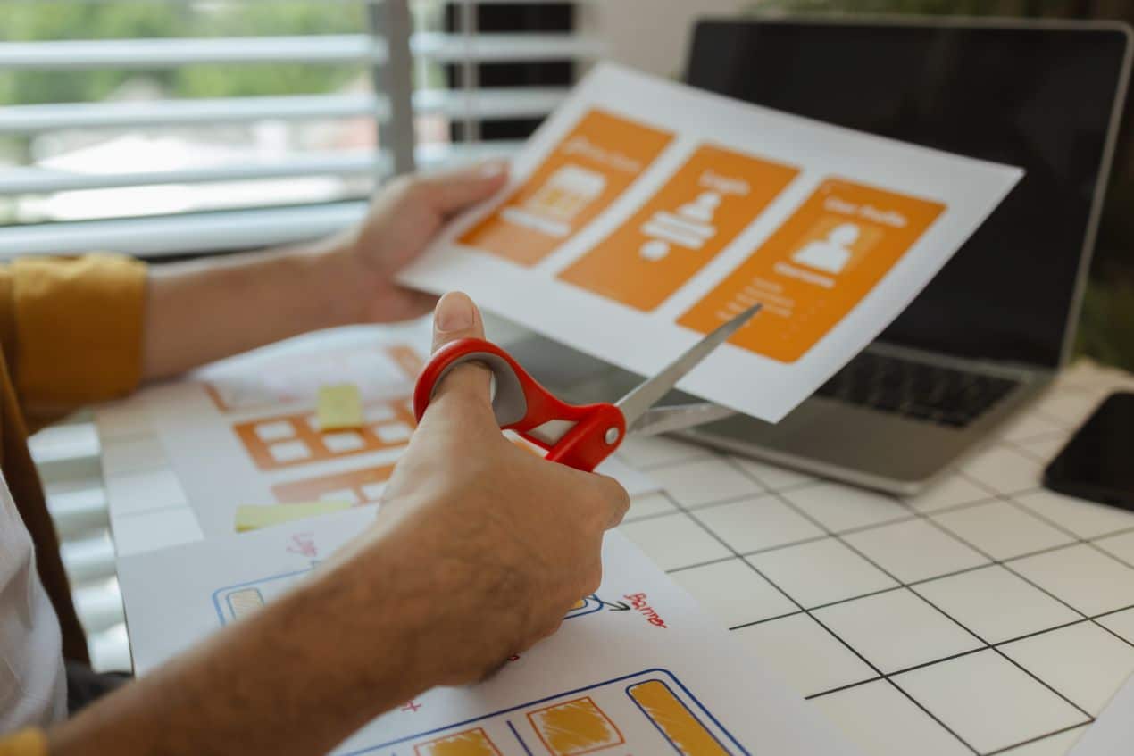
Turning Your Brand Into Print: The Creative Essentials
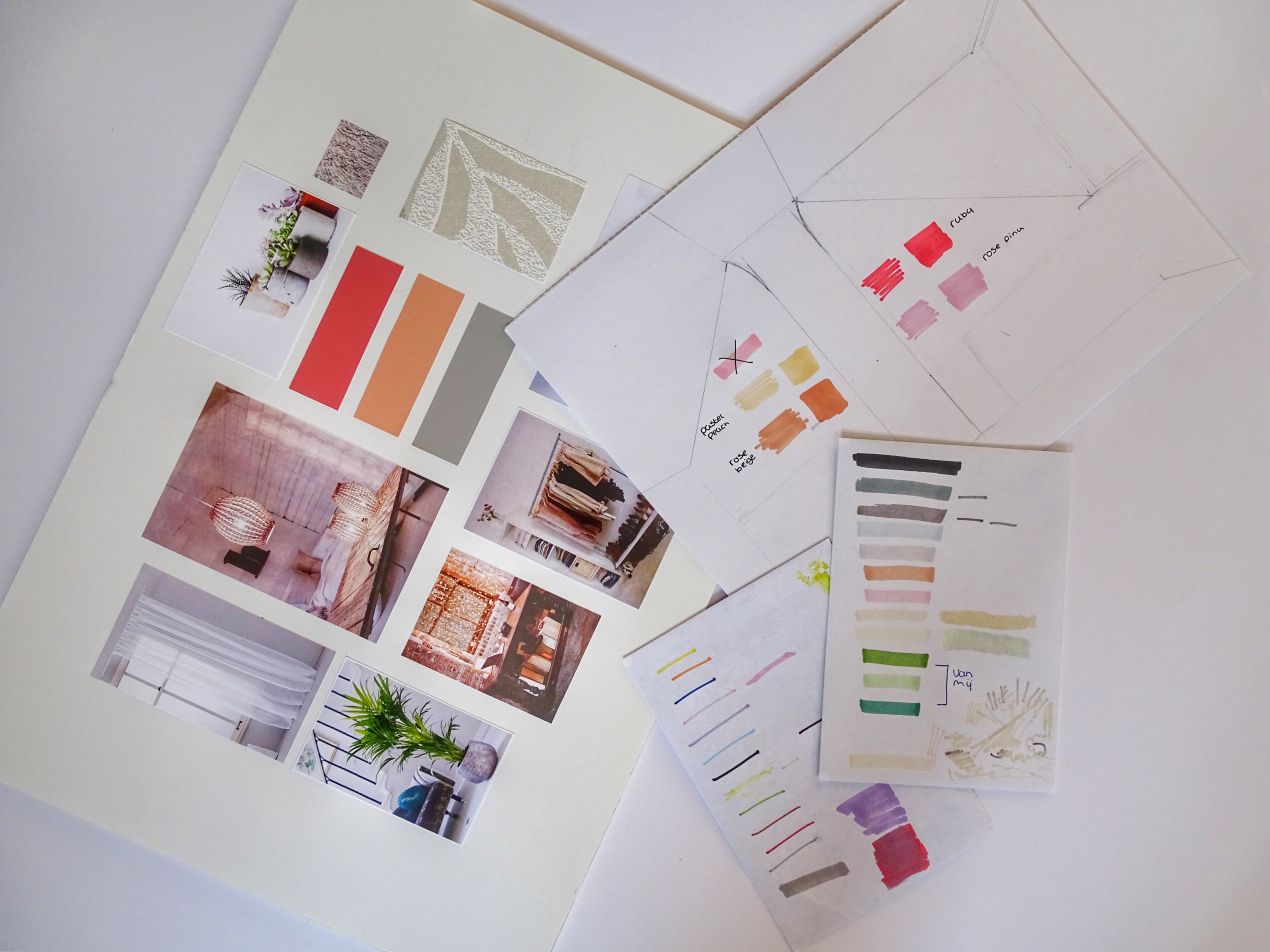
Every detail in your print design communicates something about your brand’s personality. Colors set the emotional tone, warm shades feel inviting, while cooler hues create a calm, refined mood.
Fonts also matter. They’re visual voices. Rounded, handwritten fonts feel friendly, while sharp, clean ones suggest precision and modern style. Together, these elements create a consistent visual rhythm that helps people instantly recognize your brand, whether they’re holding a flyer or reading a business card.
Imagery and paper choice take that impression even further. Real photographs of your work or authentic spaces feel much more credible than stock images.
The texture and finish of your paper (glossy, matte, or recycled) can subtly reinforce your message too. Think of layout like interior design: spacing, balance, and flow make the difference between something that feels cramped and something that feels effortless. Good design gives your message room to breathe.
Print Pieces That Make Your Brand Shine
Brochures, postcards, and flyers are more than marketing tools, they’re storytelling pieces. A well-designed brochure can walk potential clients through your process or showcase your favorite projects.
Postcards and flyers are perfect for quick updates, promotions, or reminders, and when designed thoughtfully, they feel personal rather than pushy. Even small details like rounded corners, high-quality printing, or subtle texture can make people pause and take notice.
Business cards remain one of the most personal print materials you can create. A clean, simple design with consistent colors and fonts turns a tiny piece of paper into a lasting first impression.
Yard signs and banners, on the other hand, help you stay visible in the community, they’re silent ambassadors for your work. Each piece, whether it’s large or small, should feel like it belongs to the same family, carrying your brand’s tone and message wherever it appears.
Design Mistakes That Can Ruin a Great First Impression
Even a strong brand can lose impact when design basics are ignored. Using too many fonts, clashing colors, or low-quality images can make your materials look unprofessional.
A layout that’s too crowded or hard to read distracts from your message. It’s better to focus on clarity and quality. A simple, polished design will always feel more confident and trustworthy than one that tries to do too much.
Print quality also plays a big role in how people perceive your brand. Paper that’s too thin or colors that print poorly can make your materials look rushed, even if the design itself is good. Every piece should feel deliberate, from the logo placement to the contact details.
Forgetting essential information, like how to reach you, or using inconsistent logos across materials, can weaken the connection between you and your audience. Attention to detail is what makes your brand feel dependable and professional.
Blending Print and Digital So Your Brand Feels Seamless
Your printed and digital materials should feel like two parts of the same story. When someone visits your website after seeing your flyer, they should immediately recognize the same tone, colors, and design style.
This consistency builds familiarity and trust, showing that your brand is well-organized and reliable. Even the wording you use across platforms matters, the voice of your social posts should align with what’s printed on your materials.
You can also bridge the gap between the two worlds with smart design. Adding a QR code or short, clean web address on your print materials makes it easy for people to explore more online.
Use print to guide people toward your digital spaces, where they can learn, follow, or book your services. When your brand’s look and message stay consistent from paper to screen, you create a complete, polished presence that feels natural to your audience.
Conclusion
What people see and feel when they hold your materials often shapes how they remember you. Print isn’t just about sharing information, it’s about making a personal connection that lasts beyond a quick glance.
When your designs are consistent, intentional, and true to your brand’s tone, every brochure, card, and flyer becomes part of your story. The best print materials don’t just showcase your work, they leave people with a lasting impression of your values, style, and attention to detail, the same qualities that define your brand itself.