

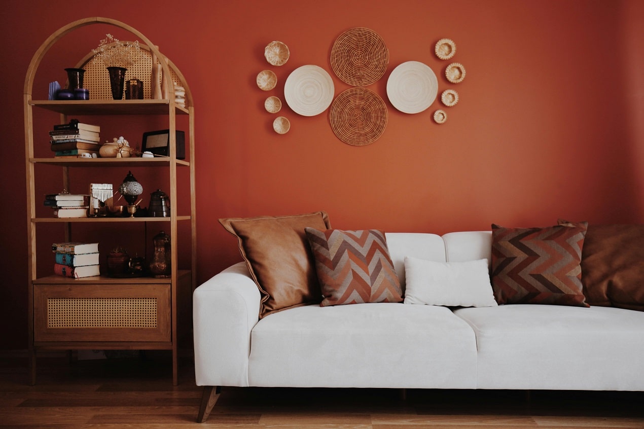
The conversation around paint has shifted from chasing the color of the year to creating spaces that feel lived in, warm, and personal. People want rooms that hold up to daily life without feeling staged, and that desire shows up in the way color is being used. Trends have grown softer around the edges, more about atmosphere than shock value. The result is a wave of palettes that breathe a little easier and bring out the character of a home without overwhelming it. The energy is relaxed but intentional, and it gives homeowners room to play with tone, texture, and light in a way that still feels fresh.
Soft Saturation And Lived In Color
A gentle rise in soft saturation has become one of the most noticeable shifts within painting trends. These are colors with presence, but they never crowd the room. Mid toned greens, grounded blues, and warm cocoa shades are landing in living spaces because they feel familiar yet current. People want color that supports their routines instead of overpowering them, and this range delivers exactly that. It allows for personality without creating a commitment that feels too bold on a random Wednesday morning.
This approach also blends beautifully with the architectural quirks that older homes tend to have. When a shade carries a softened depth, it slides naturally across uneven light or textured plaster. It hugs the room rather than fights it. That adaptability lets homeowners use these tones confidently while still making bolder notes in art, textiles, or lighting. As a result, even a subtle palette feels expressive.
Where Color Meets Comfort And Style
Rooms are being treated as atmospheric experiences, not just backdrops, and that shift influences everything from paint finishes to saturation levels. People are pulling influence from home decor trends, which lean heavily into inviting textures, matte finishes, and thoughtful layering. Those ideas translate wonderfully into paint choices, especially when colors double as emotional anchors.
Warm neutrals with a hint of rose or taupe bring out a softness that pairs well with boucle sofas, nubby rugs, or the textured throws that seem to migrate from room to room. These neutrals avoid feeling flat because they hold just enough depth to respond to changing light. They also give homeowners space to experiment with richer accent colors without tipping the balance. The whole effect is cozy without slipping into monotony, stylish without requiring constant curation.
Color Conversations Across The Country
Regional influence is making painting trends even more dynamic, which is why designers are paying closer attention to the way people talk about projects like Nashville, San Diego home painting or wherever you live. Homeowners in different climates often approach color with distinct moods. Warm states tend to lean into lighter palettes that bounce sunlight gracefully, while cooler regions embrace deeper hues that add internal warmth when daylight feels scarce.
That doesn’t mean following a script based on your zip code. Instead, these localized preferences encourage people to consider the relationship between their environment and the colors they choose. A sandy beige that feels casual on the West Coast can take on a more tailored personality in the Southeast. A muted green that feels earthy in Tennessee can look modern in a coastal kitchen. Regional trends work best as inspiration rather than instruction, nudging homeowners toward tones that feel naturally aligned with the world just outside their windows.
The Rise Of Multi Room Color Flow
Many homeowners are updating multiple rooms at once, and that has sparked a renewed interest in color flow. Instead of using a single shade across the whole house, people are choosing palettes that relate to each other without matching. That approach gives every room its own identity while still feeling connected. You might see a soft clay color drift into a mellow olive, followed by a quiet gray blue that picks up some of the same undertones. The eye moves comfortably from space to space, and the home feels cohesive without being predictable.
This technique works especially well in open concept layouts, where sightlines matter. It also gives homeowners room to experiment with stronger colors in smaller zones like powder rooms, mudrooms, or breakfast nooks. Those confident choices land more gracefully when surrounded by supporting shades that share subtle DNA. The palette becomes a story rather than a collection of unrelated ideas.
Texture, Finish, And Light Play
Finish choices have become just as important as color selection. Matte and eggshell finishes remain popular because they create a velvety look that feels polished without being fussy. These finishes soften strong pigments and help neutrals look more expensive. They also perform well in rooms where lighting changes dramatically throughout the day, absorbing glare instead of reflecting it.
At the same time, semi gloss has stepped back into the spotlight for trim and cabinetry. It adds a gentle shine that outlines the architecture and keeps the overall palette from feeling too subdued. The contrast between matte walls and subtle sheen on details brings a sense of craftsmanship that can make even a simple color palette feel curated. It is a practical move too, since higher gloss levels are easier to clean where fingerprints love to gather.
A Fresh Take On Accent Walls
Accent walls have made a comeback, but not the bold, loud kind that dominated early design blogs. The updated version works with architecture, not against it. Instead of painting the obvious wall in a room, people are choosing alcoves, fireplace surrounds, or subtle shifts in ceiling height. These natural breaks create a built in reason for a color shift, and the effect is far more sophisticated.
The best accents today often involve a tonal shift rather than a stark contrast. Think of a warm mushroom shade next to a deeper bark tone, or a gentle blue that deepens into a slate variation. The difference draws the eye but never feels forced. It is an easy way to create depth in rooms that might otherwise feel flat or wide open.
Painting trends are leaning toward authenticity, comfort, and an easy relationship with daily life. People want their homes to feel like extensions of themselves, not trend machines. Color, finish, and flow all work together when chosen with that mindset. The most exciting part is how approachable it all feels, because the modern palette thrives on warmth, flexibility, and everyday livability.